Smartwatches are stuck in a design loop. Here’s why they all look alike—and what that says about tech, taste, and the illusion of innovation.
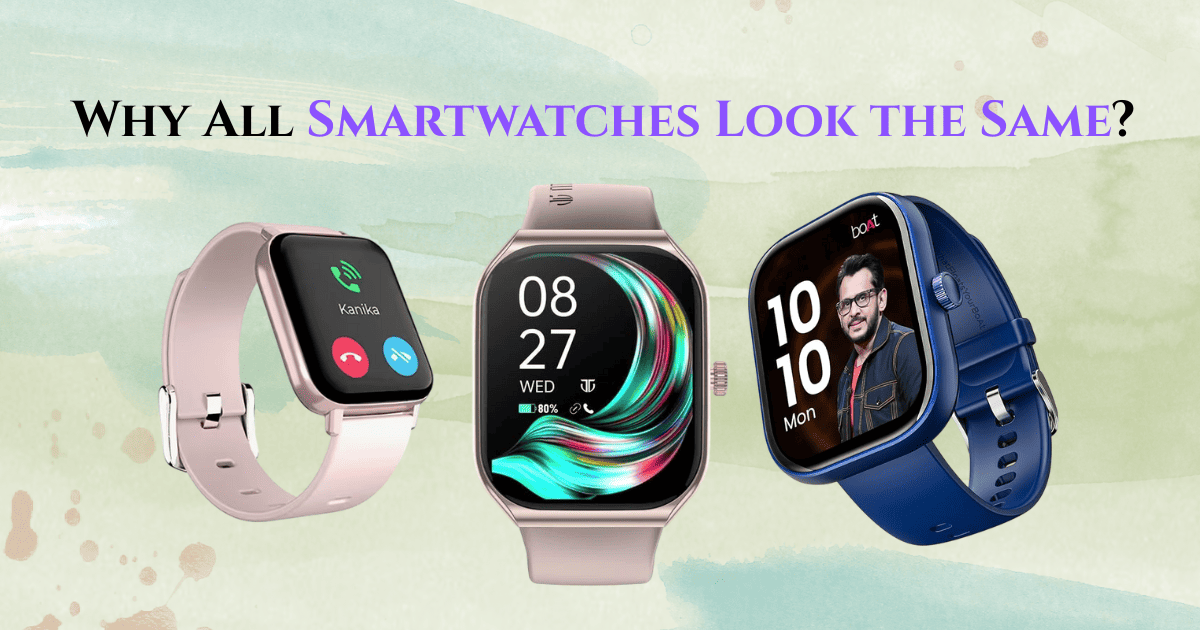
The modern smartwatch is sleek, rectangular, black, and virtually indistinguishable across brands. At a glance, you can’t always tell if it’s Apple, Samsung, Fitbit—or something from a startup trying to blend in. It’s a design copy loop, and it’s everywhere.
But here’s the real question:
Is this a sign of innovation… or a symptom of creative surrender?
The Apple Effect: Aesthetic Standard or Design Monopoly?
Apple didn’t invent the smartwatch—but it defined its look. When the Apple Watch launched in 2015, it wasn’t just a product. It was a visual blueprint. Other brands didn’t just take notes—they took the shape, the strap style, the color scheme.
We’re not looking at “inspiration.”
We’re looking at industrial conformity.
It’s like trying to compete in high fashion by copying the Louis Vuitton monogram. You’re not making a statement—you’re playing not to lose.
Why Round Faces Don’t Stand a Chance
Some brands tried circular designs. Motorola, Garmin, Huawei—they experimented with classic watch shapes. But users (trained by smartphones) demanded more screen space. A square screen feels more tech-efficient. More practical.
But here’s the irony—what feels practical often looks forgettable.
By optimizing for function, we sacrificed identity.
Fashion Meets Function—And Gets Silenced
Watches used to be bold. Gold, leather, engraved, skeleton faces. A Rolex wasn’t “smart,” but it said more about you than a notification ever could.
Now, the only thing your smartwatch says is,
“I get messages.”
The watch went from being a luxury statement to a tech utility. The rebellion of self-expression gave way to Silicon Valley’s version of minimalism.
We Mistook Minimalism for Modernism
Tech’s obsession with “clean” design is starting to backfire.
We’ve replaced detail with sameness. Every device is smooth, silver, matte, glass, aluminum. It’s sterile. And it’s spreading.
Minimalism was never supposed to mean monotony.
But look at your phone. Your laptop. Your earbuds.
Now your wrist.
See the pattern?
What Could Break the Loop?
If brands want to differentiate, they need to stop designing for screens and start designing for humans.
Imagine a smartwatch that wears like jewelry. That understands your culture. That has materials that age, textures that tell stories, and designs that don’t scream “software update available.”
Maybe the next big leap isn’t thinner glass or brighter pixels.
Maybe it’s soul.
Final Thought:
We don’t need watches that just fit our wrist.
We need watches that say something about us.
Because when everything looks the same, nothing stands out.